Chapter 4: Granger Causality Test
In the first three chapters, we discussed the classical methods for both univariate and multivariate time series forecasting. We now introduce the notion of causality and its implications on time series analysis in general. We also describe a test for the linear VAR model discussed in the previous chapter.
Prepared by: Carlo Vincienzo G. Dajac
Notations
If \(A_t\) is a stationary stochastic process, let \(\overline A_t\) represent the set of past values \({A_{t-j}, \; j=1,2,\ldots,\infty}\) and \(\overline{\overline A}_t\) represent the set of past and present values \({A_{t-j}, \; j=0,1,\ldots,\infty}\). Further, let \(\overline A(k)\) represent the set \({A_{t-j}, \; j=k,k+1,\ldots,\infty}\).
Denote the optimum, unbiased, least-squares predictor of \(A_t\) using the set of values \(B_t\) by \(P_t (A|B)\). Thus, for instance, \(P_t (X|\overline X)\) will be the optimum predictor of \(X_t\) using only past \(X_t\). The predictive error series will be denoted by \(\varepsilon_t(A|B) = A_t - P_t(A|B)\). Let \(\sigma^2 (A|B)\) be the variance of \(\varepsilon_t(A|B)\).
Let \(U_t\) be all the information in the universe accumulated since time \(t-1\) and let \(U_t - Y_t\) denote all this information apart from the specified series \(Y_t\), which is another stationary time series that is different from \(X_t\).
Definitions
Causality
If \(\sigma^2 (X|U) < \sigma^2 (X| \overline{U-Y})\), we say that \(Y\) is causing \(X\), denoted by \(Y_t \implies X_t\). We say that \(Y_t\) is causing \(X_t\) if we are able to predict \(X_t\) using all available information than if the information apart from \(Y_t\) had been used.
Feedback
If \(\sigma^2 (X|\overline U) < \sigma^2 (X| \overline{U-Y})\) and \(\sigma^2 (Y|\overline U) < \sigma^2 (Y| \overline{U-X})\), we say that feedback is occurring, which is denoted by \(Y_t \iff X_t\), i.e., feedback is said to occur when \(X_t\) is causing \(Y_t\) and also \(Y_t\) is causing \(X_t\).
Instantaneous Causality
If \(\sigma^2 (X|\overline U, \overline{\overline Y}) < \sigma^2 (X| \overline U)\), we say that instantaneous causality \(Y_t \implies X_t\) is occurring. In other words, the current value of \(X_t\) is better “predicted” if the present value of \(Y_t\) is included in the “prediction” than if it is not.
Causality Lag
If \(Y_t \implies X_t\), we define the (integer) causality lag \(m\) to be the least value of \(k\) such that \(\sigma^2 (X|U-Y(k)) < \sigma^2 (X|U-Y(k+1))\). Thus, knowing the values \(Y_{t-j}, \; j=0,1,\ldots,m-1\) will be of no help in improving the prediction of \(X_t\)
Assumptions
\(X_t\) and \(Y_t\) are stationary.
\(P_t (A|B)\) is already optimized.
Testing for Granger Causality
We will be first building VAR models for our examples in this section. In addition to the steps outlined in the previous chapter, we will just call built-in Granger causality test function and configure it accordingly.
import pandas as pd
import numpy as np
import matplotlib.pyplot as plt
from pandas.plotting import lag_plot
from statsmodels.tsa.vector_ar.var_model import VAR
from statsmodels.tsa.stattools import adfuller, kpss, grangercausalitytests
import warnings
warnings.filterwarnings("ignore")
Example 1: Ipo Dam Dataset
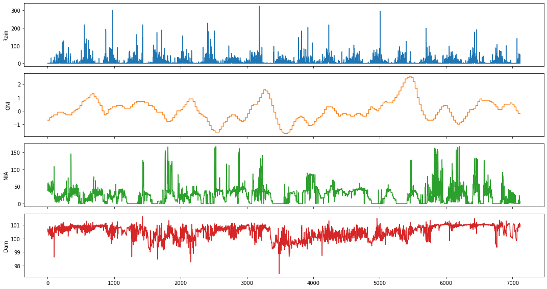
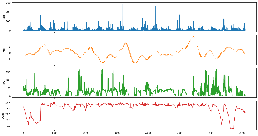
We will use the Ipo dataset in this example. It contains daily measurements of the following variables: rainfall (in millimeters), Oceanic Niño Index (ONI), NIA release flow (in cubic meters per second), and dam water level (in meters), respectively.
ipo_df = pd.read_csv('../data/Ipo_dataset.csv', index_col='Time');
ipo_df = ipo_df.dropna()
ipo_df.head()
| Rain | ONI | NIA | Dam | |
|---|---|---|---|---|
| Time | ||||
| 0 | 0.0 | -0.7 | 38.225693 | 100.70 |
| 1 | 0.0 | -0.7 | 57.996530 | 100.63 |
| 2 | 0.0 | -0.7 | 49.119213 | 100.56 |
| 3 | 0.0 | -0.7 | 47.034720 | 100.55 |
| 4 | 0.0 | -0.7 | 42.223380 | 100.48 |
fig,ax = plt.subplots(4, figsize=(15,8), sharex=True)
plot_cols = ['Rain', 'ONI', 'NIA', 'Dam']
ipo_df[plot_cols].plot(subplots=True, legend=False, ax=ax)
for a in range(len(ax)):
    ax[a].set_ylabel(plot_cols[a])
ax[-1].set_xlabel('')
plt.tight_layout()
plt.show()
Causality between Rainfall and Ipo Dam Water Level
For this example, we will focus on the Rain and Dam time series.
data_df = ipo_df.drop(['ONI', 'NIA'], axis=1)
data_df.head()
| Rain | Dam | |
|---|---|---|
| Time | ||
| 0 | 0.0 | 100.70 |
| 1 | 0.0 | 100.63 |
| 2 | 0.0 | 100.56 |
| 3 | 0.0 | 100.55 |
| 4 | 0.0 | 100.48 |
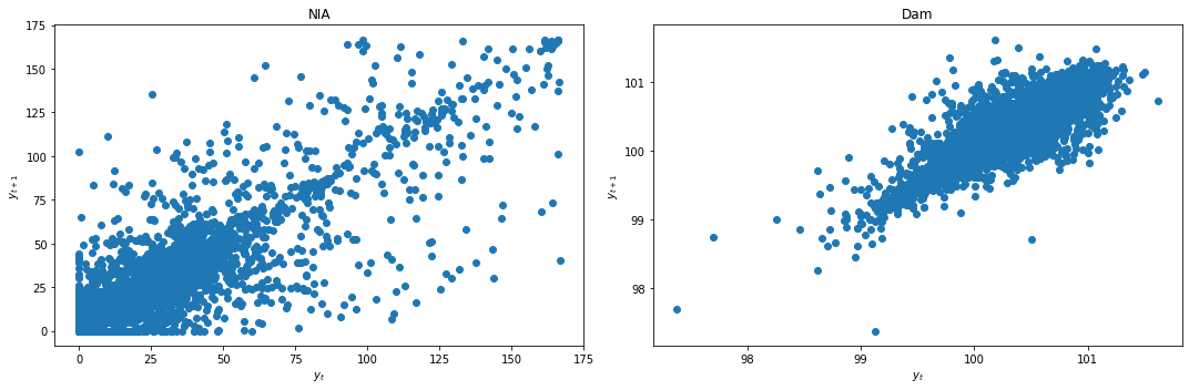
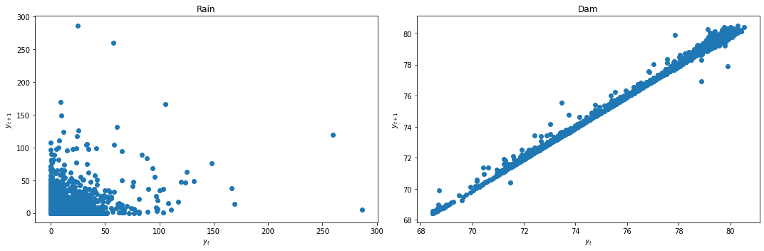
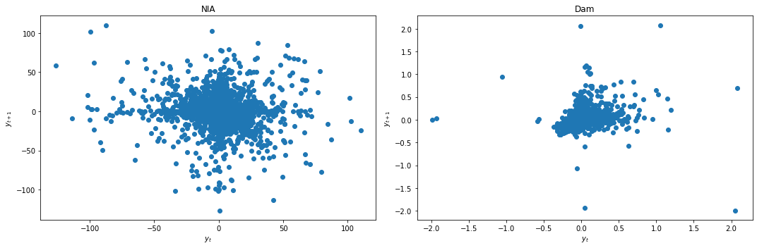
We look at the lag plots to quickly check for stationarity.
def lag_plots(data_df):
    f, (ax1, ax2) = plt.subplots(1, 2, figsize=(15, 5))

    lag_plot(data_df[data_df.columns[0]], ax=ax1)
    ax1.set_title(data_df.columns[0]);

    lag_plot(data_df[data_df.columns[1]], ax=ax2)
    ax2.set_title(data_df.columns[1]);

    ax1.set_ylabel('$y_{t+1}$');
    ax1.set_xlabel('$y_t$');
    ax2.set_ylabel('$y_{t+1}$');
    ax2.set_xlabel('$y_t$');

    plt.tight_layout()
lag_plots(data_df)
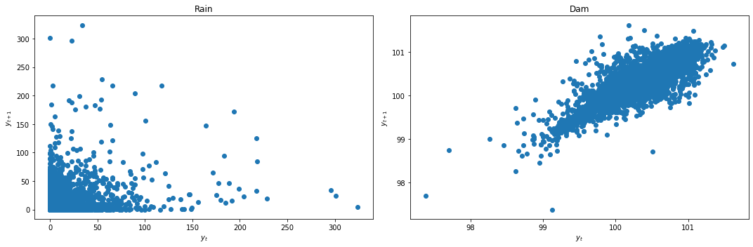
Result: Dam does not look stationary. Rainfall lag plot is inconclusive.
We use KPSS and ADF tests discussed in the previous chapter to conclusively check for stationarity.
def kpss_test(data_df):
    test_stat, p_val = [], []
    cv_1pct, cv_2p5pct, cv_5pct, cv_10pct = [], [], [], []
    for c in data_df.columns:
        kpss_res = kpss(data_df[c].dropna(), regression='ct')
        test_stat.append(kpss_res[0])
        p_val.append(kpss_res[1])
        cv_1pct.append(kpss_res[3]['1%'])
        cv_2p5pct.append(kpss_res[3]['2.5%'])
        cv_5pct.append(kpss_res[3]['5%'])
        cv_10pct.append(kpss_res[3]['10%'])
    kpss_res_df = pd.DataFrame({'Test statistic': test_stat,
                               'p-value': p_val,
                               'Critical value - 1%': cv_1pct,
                               'Critical value - 2.5%': cv_2p5pct,
                               'Critical value - 5%': cv_5pct,
                               'Critical value - 10%': cv_10pct},
                             index=data_df.columns).T
    kpss_res_df = kpss_res_df.round(4)
    return kpss_res_df
kpss_test(data_df)
| Rain | Dam | |
|---|---|---|
| Test statistic | 0.018 | 1.8045 |
| p-value | 0.100 | 0.0100 |
| Critical value - 1% | 0.216 | 0.2160 |
| Critical value - 2.5% | 0.176 | 0.1760 |
| Critical value - 5% | 0.146 | 0.1460 |
| Critical value - 10% | 0.119 | 0.1190 |
Result: Rain is stationary, while Dam is not.
def adf_test(data_df):
    test_stat, p_val = [], []
    cv_1pct, cv_5pct, cv_10pct = [], [], []
    for c in data_df.columns:
        adf_res = adfuller(data_df[c].dropna())
        test_stat.append(adf_res[0])
        p_val.append(adf_res[1])
        cv_1pct.append(adf_res[4]['1%'])
        cv_5pct.append(adf_res[4]['5%'])
        cv_10pct.append(adf_res[4]['10%'])
    adf_res_df = pd.DataFrame({'Test statistic': test_stat,
                               'p-value': p_val,
                               'Critical value - 1%': cv_1pct,
                               'Critical value - 5%': cv_5pct,
                               'Critical value - 10%': cv_10pct},
                             index=data_df.columns).T
    adf_res_df = adf_res_df.round(4)
    return adf_res_df
adf_test(data_df)
| Rain | Dam | |
|---|---|---|
| Test statistic | -8.6223 | -5.8742 |
| p-value | 0.0000 | 0.0000 |
| Critical value - 1% | -3.4313 | -3.4313 |
| Critical value - 5% | -2.8619 | -2.8619 |
| Critical value - 10% | -2.5670 | -2.5670 |
Result: Both data are stationary.
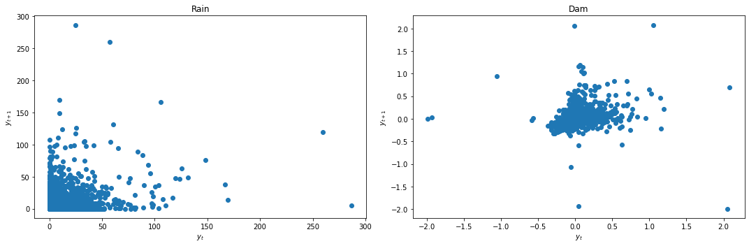
Since both the lag plot and KPSS test indicate that Dam is not stationary, we apply differencing first before building our VAR model.
data_df['Dam'] = data_df['Dam'] - data_df['Dam'].shift(1)
data_df = data_df.dropna()
We again look at the lag plots and apply the KPSS and ADF tests.
lag_plots(data_df)
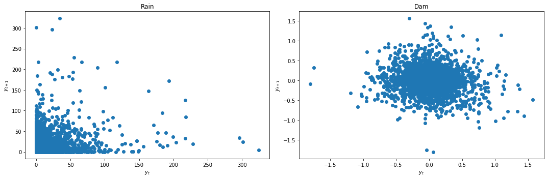
kpss_test(data_df)
| Rain | Dam | |
|---|---|---|
| Test statistic | 0.0179 | 0.0047 |
| p-value | 0.1000 | 0.1000 |
| Critical value - 1% | 0.2160 | 0.2160 |
| Critical value - 2.5% | 0.1760 | 0.1760 |
| Critical value - 5% | 0.1460 | 0.1460 |
| Critical value - 10% | 0.1190 | 0.1190 |
adf_test(data_df)
| Rain | Dam | |
|---|---|---|
| Test statistic | -8.6227 | -21.5919 |
| p-value | 0.0000 | 0.0000 |
| Critical value - 1% | -3.4313 | -3.4313 |
| Critical value - 5% | -2.8619 | -2.8619 |
| Critical value - 10% | -2.5670 | -2.5670 |
Result: All three conclusively agree that both data are now stationary.
We next split the data into train and test sets for the VAR model.
def splitter(data_df):
    end = round(len(data_df)*.8)
    train_df = data_df[:end]
    test_df = data_df[end:]
    return train_df, test_df
train_df, test_df = splitter(data_df)
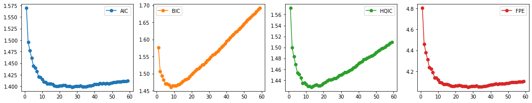
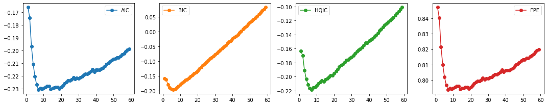
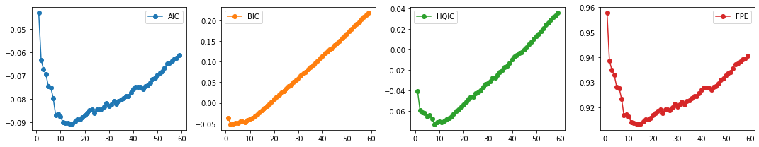
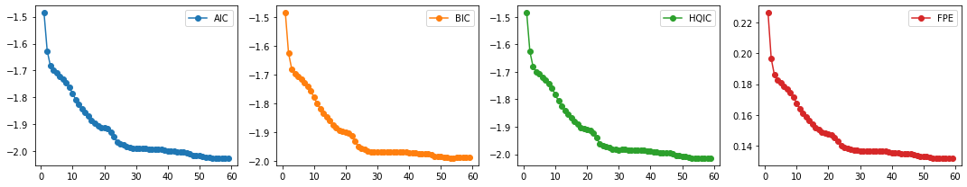
We then select the VAR order \(p\) by computing the different multivariate information criteria (AIC, BIC, HQIC), and FPE.
def select_p(train_df):
    aic, bic, fpe, hqic = [], [], [], []
    model = VAR(train_df)
    p = np.arange(1,60)
    for i in p:
        result = model.fit(i)
        aic.append(result.aic)
        bic.append(result.bic)
        fpe.append(result.fpe)
        hqic.append(result.hqic)
    lags_metrics_df = pd.DataFrame({'AIC': aic,
                                    'BIC': bic,
                                    'HQIC': hqic,
                                    'FPE': fpe},
                                   index=p)
    fig, ax = plt.subplots(1, 4, figsize=(15, 3), sharex=True)
    lags_metrics_df.plot(subplots=True, ax=ax, marker='o')
    plt.tight_layout()
    print(lags_metrics_df.idxmin(axis=0))
select_p(train_df)
AIC     21
BIC      8
HQIC    11
FPE     21
dtype: int64
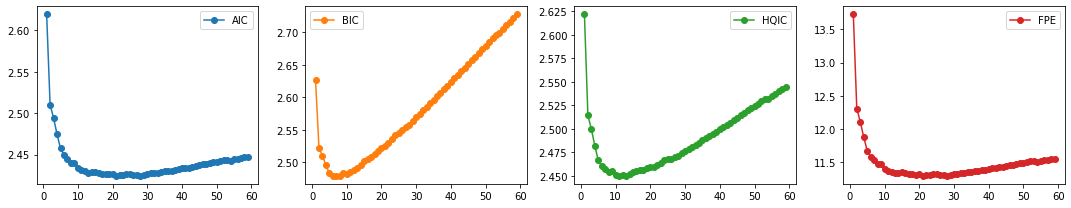
Result: We see that BIC has the lowest value at \(p=8\) while HQIC at \(p=11\). Although both AIC and FPE have the lowest value at \(p=21\), their plots also show an elbow. We can thus select the number of lags to be 8 (also for computational efficiency).
We now fit the VAR model with the chosen order.
p = 8
model = VAR(train_df)
var_model = model.fit(p)
We can finally test the variables for Granger Causality
def granger_causation_matrix(data, variables, p, test = 'ssr_chi2test', verbose=False):
    """Check Granger Causality of all possible combinations of the time series.
    The rows are the response variables, columns are predictors. The values in the table
    are the P-Values. P-Values lesser than the significance level (0.05), implies
    the Null Hypothesis that the coefficients of the corresponding past values is
    zero, that is, the X does not cause Y can be rejected.

    data      : pandas dataframe containing the time series variables
    variables : list containing names of the time series variables.
    """
    df = pd.DataFrame(np.zeros((len(variables), len(variables))), columns=variables, index=variables)
    for c in df.columns:
        for r in df.index:
            test_result = grangercausalitytests(data[[r, c]], p, verbose=False)
            p_values = [round(test_result[i+1][0][test][1],4) for i in range(p)]
            if verbose: print(f'Y = {r}, X = {c}, P Values = {p_values}')
            min_p_value = np.min(p_values)
            df.loc[r, c] = min_p_value
    df.columns = [var + '_x' for var in variables]
    df.index = [var + '_y' for var in variables]
    return df
granger_causation_matrix(train_df, train_df.columns, p)
| Rain_x | Dam_x | |
|---|---|---|
| Rain_y | 1.0 | 0.2169 |
| Dam_y | 0.0 | 1.0000 |
Recall: If a given p-value is < significance level (0.05), then, the corresponding X series (column) causes the Y (row).
Results: For this particular example, we can say that rainfall Granger causes changes in the dam water level. This means that rainfall data improves changes in dam water level prediction performance.
On the other hand, changes in dam water level does not Granger cause rainfall. This means that changes in dam water level data does not improve rainfall prediction performance.
Causality between NIA Release Flow and Ipo Dam Water Level
In this next example, we now focus on the NIA and Dam time series.
data_df = ipo_df.drop(['ONI', 'Rain'], axis=1)
data_df.head()
| NIA | Dam | |
|---|---|---|
| Time | ||
| 0 | 38.225693 | 100.70 |
| 1 | 57.996530 | 100.63 |
| 2 | 49.119213 | 100.56 |
| 3 | 47.034720 | 100.55 |
| 4 | 42.223380 | 100.48 |
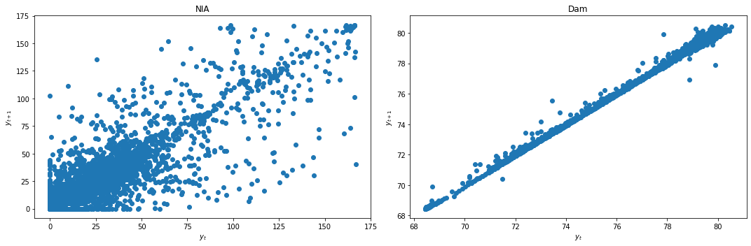
We first check for stationarity by looking at the lag plots and applying the KPSS and ADF tests.
lag_plots(data_df)
kpss_test(data_df)
| NIA | Dam | |
|---|---|---|
| Test statistic | 0.184 | 1.8045 |
| p-value | 0.022 | 0.0100 |
| Critical value - 1% | 0.216 | 0.2160 |
| Critical value - 2.5% | 0.176 | 0.1760 |
| Critical value - 5% | 0.146 | 0.1460 |
| Critical value - 10% | 0.119 | 0.1190 |
adf_test(data_df)
| NIA | Dam | |
|---|---|---|
| Test statistic | -6.6030 | -5.8742 |
| p-value | 0.0000 | 0.0000 |
| Critical value - 1% | -3.4313 | -3.4313 |
| Critical value - 5% | -2.8619 | -2.8619 |
| Critical value - 10% | -2.5670 | -2.5670 |
Result: All three conclusively show that both data are not stationary.
We apply differencing and recheck for stationarity.
data_df['NIA'] = data_df['NIA'] - data_df['NIA'].shift(1)
data_df['Dam'] = data_df['Dam'] - data_df['Dam'].shift(1)
data_df = data_df.dropna()
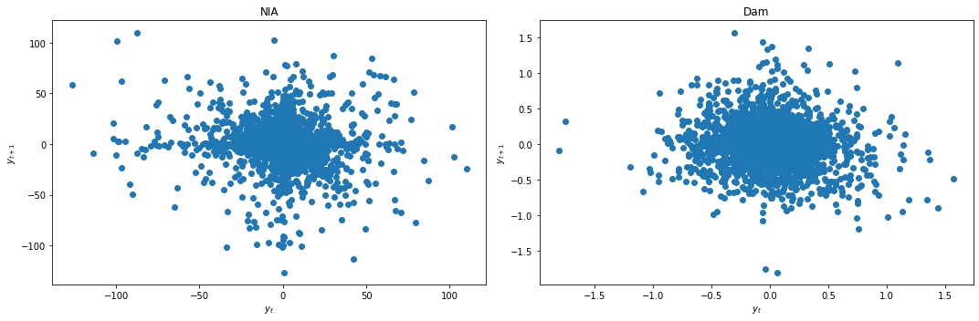
lag_plots(data_df)
kpss_test(data_df)
| NIA | Dam | |
|---|---|---|
| Test statistic | 0.0048 | 0.0047 |
| p-value | 0.1000 | 0.1000 |
| Critical value - 1% | 0.2160 | 0.2160 |
| Critical value - 2.5% | 0.1760 | 0.1760 |
| Critical value - 5% | 0.1460 | 0.1460 |
| Critical value - 10% | 0.1190 | 0.1190 |
adf_test(data_df)
| NIA | Dam | |
|---|---|---|
| Test statistic | -21.2837 | -21.5919 |
| p-value | 0.0000 | 0.0000 |
| Critical value - 1% | -3.4313 | -3.4313 |
| Critical value - 5% | -2.8619 | -2.8619 |
| Critical value - 10% | -2.5670 | -2.5670 |
Result: All three conclusively agree that both data are now stationary.
We next split the data and select the lag order \(p\).
train_df, test_df = splitter(data_df)
select_p(train_df)
AIC     27
BIC      8
HQIC    13
FPE     27
dtype: int64
We select \(p=8\) with the same reasons as before. We finally fit our VAR model and test for Granger Causality.
p = 8
model = VAR(train_df)
var_model = model.fit(p)
granger_causation_matrix(train_df, train_df.columns, p)
| NIA_x | Dam_x | |
|---|---|---|
| NIA_y | 1.0000 | 0.0007 |
| Dam_y | 0.0216 | 1.0000 |
Recall: If a given p-value is < significance level (0.05), then, the corresponding X series (column) causes the Y (row).
Result: For this particular example, we can say that changes in NIA release flow Granger causes changes in the dam water level. Conversely, changes in dam water level also Granger causes changes in the NIA release flow. This is an example of the feedback mentioned in an earlier section above. This means that NIA release flow data improves changes in dam water level prediction performance, and dam water level data also improves changes in NIA release flow prediction performance.
Example 2: Causality for La Mesa Dam
We now do the same steps for the La Mesa dataset.
lamesa_df = pd.read_csv('../data/La Mesa_dataset.csv', index_col='Time');
lamesa_df = lamesa_df.dropna()
lamesa_df.head()
| Rain | ONI | NIA | Dam | |
|---|---|---|---|---|
| Time | ||||
| 0 | 0.0 | -0.7 | 38.225693 | 78.63 |
| 1 | 0.0 | -0.7 | 57.996530 | 78.63 |
| 2 | 0.0 | -0.7 | 49.119213 | 78.61 |
| 3 | 0.0 | -0.7 | 47.034720 | 78.59 |
| 4 | 0.0 | -0.7 | 42.223380 | 78.56 |
fig,ax = plt.subplots(4, figsize=(15,8), sharex=True)
plot_cols = ['Rain', 'ONI', 'NIA', 'Dam']
lamesa_df[plot_cols].plot(subplots=True, legend=False, ax=ax)
for a in range(len(ax)):
    ax[a].set_ylabel(plot_cols[a])
ax[-1].set_xlabel('')
plt.tight_layout()
plt.show()
Causality between Rainfall and La Mesa Dam Water Level
In this next example, we first consider the Rain and Dam time series.
data_df = lamesa_df.drop(['ONI', 'NIA'], axis=1)
data_df.head()
| Rain | Dam | |
|---|---|---|
| Time | ||
| 0 | 0.0 | 78.63 |
| 1 | 0.0 | 78.63 |
| 2 | 0.0 | 78.61 |
| 3 | 0.0 | 78.59 |
| 4 | 0.0 | 78.56 |
We first check for stationarity by looking at the lag plots and applying the KPSS and ADF tests.
lag_plots(data_df)
kpss_test(data_df)
| Rain | Dam | |
|---|---|---|
| Test statistic | 0.0327 | 1.8845 |
| p-value | 0.1000 | 0.0100 |
| Critical value - 1% | 0.2160 | 0.2160 |
| Critical value - 2.5% | 0.1760 | 0.1760 |
| Critical value - 5% | 0.1460 | 0.1460 |
| Critical value - 10% | 0.1190 | 0.1190 |
adf_test(data_df)
| Rain | Dam | |
|---|---|---|
| Test statistic | -8.7136 | -4.2004 |
| p-value | 0.0000 | 0.0007 |
| Critical value - 1% | -3.4313 | -3.4313 |
| Critical value - 5% | -2.8619 | -2.8619 |
| Critical value - 10% | -2.5670 | -2.5670 |
Result: All three conclusively show that again Rain is stationary, while Dam is not.
We apply differencing and recheck for stationarity.
data_df['Dam'] = data_df['Dam'] - data_df['Dam'].shift(1)
data_df = data_df.dropna()
lag_plots(data_df)
kpss_test(data_df)
| Rain | Dam | |
|---|---|---|
| Test statistic | 0.0327 | 0.0226 |
| p-value | 0.1000 | 0.1000 |
| Critical value - 1% | 0.2160 | 0.2160 |
| Critical value - 2.5% | 0.1760 | 0.1760 |
| Critical value - 5% | 0.1460 | 0.1460 |
| Critical value - 10% | 0.1190 | 0.1190 |
adf_test(data_df)
| Rain | Dam | |
|---|---|---|
| Test statistic | -8.7138 | -26.5948 |
| p-value | 0.0000 | 0.0000 |
| Critical value - 1% | -3.4313 | -3.4313 |
| Critical value - 5% | -2.8619 | -2.8619 |
| Critical value - 10% | -2.5670 | -2.5670 |
Result: All three conclusively agree that both data are now stationary.
We next split the data and select the lag order \(p\).
train_df, test_df = splitter(data_df)
select_p(train_df)
AIC     7
BIC     6
HQIC    7
FPE     7
dtype: int64
We select \(p=7\). We finally fit our VAR model and test for Granger Causality.
p = 7
model = VAR(train_df)
var_model = model.fit(p)
granger_causation_matrix(train_df, train_df.columns, p)
| Rain_x | Dam_x | |
|---|---|---|
| Rain_y | 1.0 | 0.0005 |
| Dam_y | 0.0 | 1.0000 |
Recall: If a given p-value is < significance level (0.05), then, the corresponding X series (column) causes the Y (row).
Result: For this particular example, we can say that rainfall Granger causes changes in the dam water level. Conversely, changes in dam water level also Granger causes rainfall. This is another example of feedback. This means that rainfall data improves changes in dam water level prediction performance, and dam water level data also improves rainfall prediction performance.
Causality between NIA Release Flow and La Mesa Dam Water Level
In this next example, we now focus on the NIA and Dam time series.
data_df = lamesa_df.drop(['ONI', 'Rain'], axis=1)
data_df.head()
| NIA | Dam | |
|---|---|---|
| Time | ||
| 0 | 38.225693 | 78.63 |
| 1 | 57.996530 | 78.63 |
| 2 | 49.119213 | 78.61 |
| 3 | 47.034720 | 78.59 |
| 4 | 42.223380 | 78.56 |
We first check for stationarity by looking at the lag plots and applying the KPSS and ADF tests.
lag_plots(data_df)
kpss_test(data_df)
| NIA | Dam | |
|---|---|---|
| Test statistic | 0.184 | 1.8845 |
| p-value | 0.022 | 0.0100 |
| Critical value - 1% | 0.216 | 0.2160 |
| Critical value - 2.5% | 0.176 | 0.1760 |
| Critical value - 5% | 0.146 | 0.1460 |
| Critical value - 10% | 0.119 | 0.1190 |
adf_test(data_df)
| NIA | Dam | |
|---|---|---|
| Test statistic | -6.6030 | -4.2004 |
| p-value | 0.0000 | 0.0007 |
| Critical value - 1% | -3.4313 | -3.4313 |
| Critical value - 5% | -2.8619 | -2.8619 |
| Critical value - 10% | -2.5670 | -2.5670 |
Result: All three conclusively show that both data are not stationary.
We apply differencing and recheck for stationarity.
data_df['NIA'] = data_df['NIA'] - data_df['NIA'].shift(1)
data_df['Dam'] = data_df['Dam'] - data_df['Dam'].shift(1)
data_df = data_df.dropna()
lag_plots(data_df)
kpss_test(data_df)
| NIA | Dam | |
|---|---|---|
| Test statistic | 0.0048 | 0.0226 |
| p-value | 0.1000 | 0.1000 |
| Critical value - 1% | 0.2160 | 0.2160 |
| Critical value - 2.5% | 0.1760 | 0.1760 |
| Critical value - 5% | 0.1460 | 0.1460 |
| Critical value - 10% | 0.1190 | 0.1190 |
adf_test(data_df)
| NIA | Dam | |
|---|---|---|
| Test statistic | -21.2837 | -26.5948 |
| p-value | 0.0000 | 0.0000 |
| Critical value - 1% | -3.4313 | -3.4313 |
| Critical value - 5% | -2.8619 | -2.8619 |
| Critical value - 10% | -2.5670 | -2.5670 |
Result: All three conclusively agree that both data are now stationary.
We next split the data and select the lag order \(p\).
train_df, test_df = splitter(data_df)
select_p(train_df)
AIC     14
BIC      2
HQIC     8
FPE     14
dtype: int64
We select \(p=14\). We finally fit our VAR model and test for Granger Causality.
p = 14
model = VAR(train_df)
var_model = model.fit(p)
granger_causation_matrix(train_df, train_df.columns, p)
| NIA_x | Dam_x | |
|---|---|---|
| NIA_y | 1.000 | 0.1632 |
| Dam_y | 0.636 | 1.0000 |
Recall: If a given p-value is < significance level (0.05), then, the corresponding X series (column) causes the Y (row).
Result: We see that, unlike for Ipo Dam, changes in NIA release flow and changes in the dam water level do NOT Granger cause one another for La Mesa Dam. This means that NIA release flow data does NOT improve changes in dam water level prediction performance, and dam water level data also does NOT improve changes in NIA release flow prediction performance.
Exercises
As exercises, the reader can test for Granger Causality between other pairs of variables from both the Ipo and La Mesa datasets, as well as from the Angat dataset.
Example 3: Jena Climate Data
We look back at the Jena climate dataset and explore which variables are Granger causal to another.
train_df = pd.read_csv('../data/train_series_datetime.csv',index_col=0).set_index('Date Time')
val_df = pd.read_csv('../data/val_series_datetime.csv',index_col=0).set_index('Date Time')
test_df = pd.read_csv('../data/test_series_datetime.csv',index_col=0).set_index('Date Time')
train_df.index = pd.to_datetime(train_df.index)
val_df.index = pd.to_datetime(val_df.index)
test_df.index = pd.to_datetime(test_df.index)

train_val_df = pd.concat([train_df, val_df])
jena_df = pd.concat([train_df, val_df, test_df])
jena_df.head()
| p (mbar) | T (degC) | Tpot (K) | Tdew (degC) | rh (%) | VPmax (mbar) | VPact (mbar) | VPdef (mbar) | sh (g/kg) | H2OC (mmol/mol) | rho (g/m**3) | wv (m/s) | max. wv (m/s) | wd (deg) | |
|---|---|---|---|---|---|---|---|---|---|---|---|---|---|---|
| Date Time | ||||||||||||||
| 2009-01-01 00:10:00 | 996.52 | -8.02 | 265.40 | -8.90 | 93.3 | 3.33 | 3.11 | 0.22 | 1.94 | 3.12 | 1307.75 | 1.03 | 1.75 | 152.3 |
| 2009-01-01 01:10:00 | 996.50 | -7.62 | 265.81 | -8.30 | 94.8 | 3.44 | 3.26 | 0.18 | 2.04 | 3.27 | 1305.68 | 0.18 | 0.63 | 166.5 |
| 2009-01-01 02:10:00 | 996.63 | -8.85 | 264.57 | -9.70 | 93.5 | 3.12 | 2.92 | 0.20 | 1.82 | 2.93 | 1312.11 | 0.16 | 0.50 | 158.3 |
| 2009-01-01 03:10:00 | 996.87 | -8.84 | 264.56 | -9.69 | 93.5 | 3.13 | 2.92 | 0.20 | 1.83 | 2.93 | 1312.37 | 0.07 | 0.25 | 129.3 |
| 2009-01-01 04:10:00 | 997.05 | -9.23 | 264.15 | -10.25 | 92.2 | 3.03 | 2.79 | 0.24 | 1.74 | 2.80 | 1314.62 | 0.10 | 0.38 | 203.9 |
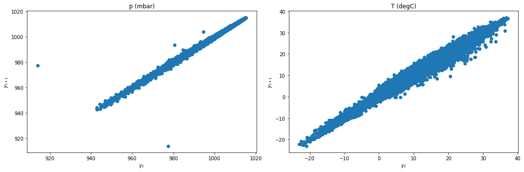
Causality between Pressure and Temperature
In this next example, we first consider the p and T time series.
data_df = jena_df.iloc[:,:2]
data_df.head()
| p (mbar) | T (degC) | |
|---|---|---|
| Date Time | ||
| 2009-01-01 00:10:00 | 996.52 | -8.02 |
| 2009-01-01 01:10:00 | 996.50 | -7.62 |
| 2009-01-01 02:10:00 | 996.63 | -8.85 |
| 2009-01-01 03:10:00 | 996.87 | -8.84 |
| 2009-01-01 04:10:00 | 997.05 | -9.23 |
We first check for stationarity by looking at the lag plots and applying the KPSS and ADF tests.
lag_plots(data_df)
kpss_test(data_df)
| p (mbar) | T (degC) | |
|---|---|---|
| Test statistic | 0.2295 | 0.3649 |
| p-value | 0.0100 | 0.0100 |
| Critical value - 1% | 0.2160 | 0.2160 |
| Critical value - 2.5% | 0.1760 | 0.1760 |
| Critical value - 5% | 0.1460 | 0.1460 |
| Critical value - 10% | 0.1190 | 0.1190 |
adf_test(data_df)
| p (mbar) | T (degC) | |
|---|---|---|
| Test statistic | -18.3281 | -8.5824 |
| p-value | 0.0000 | 0.0000 |
| Critical value - 1% | -3.4304 | -3.4304 |
| Critical value - 5% | -2.8616 | -2.8616 |
| Critical value - 10% | -2.5668 | -2.5668 |
Result: All three conclusively show that both data are not stationary.
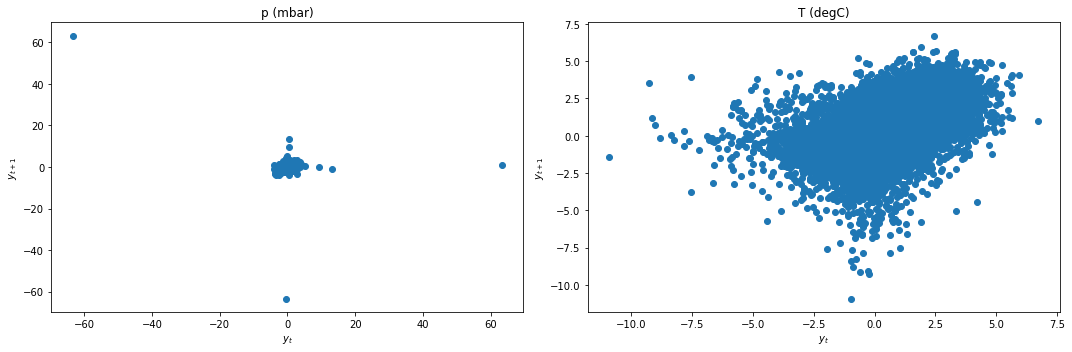
We apply differencing and recheck for stationarity.
data_df['p (mbar)'] = data_df['p (mbar)'] - data_df['p (mbar)'].shift(1)
data_df['T (degC)'] = data_df['T (degC)'] - data_df['T (degC)'].shift(1)
data_df = data_df.dropna()
lag_plots(data_df)
kpss_test(data_df)
| p (mbar) | T (degC) | |
|---|---|---|
| Test statistic | 0.0009 | 0.0024 |
| p-value | 0.1000 | 0.1000 |
| Critical value - 1% | 0.2160 | 0.2160 |
| Critical value - 2.5% | 0.1760 | 0.1760 |
| Critical value - 5% | 0.1460 | 0.1460 |
| Critical value - 10% | 0.1190 | 0.1190 |
adf_test(data_df)
| p (mbar) | T (degC) | |
|---|---|---|
| Test statistic | -38.6219 | -41.3374 |
| p-value | 0.0000 | 0.0000 |
| Critical value - 1% | -3.4304 | -3.4304 |
| Critical value - 5% | -2.8616 | -2.8616 |
| Critical value - 10% | -2.5668 | -2.5668 |
Result: All three conclusively agree that both data are now stationary.
We next split the data and select the lag order \(p\).
train_df, test_df = splitter(data_df)
select_p(train_df)
AIC     59
BIC     53
HQIC    54
FPE     59
dtype: int64
We select \(p=30\). We finally fit our VAR model and test for Granger Causality.
p = 30
model = VAR(train_df)
var_model = model.fit(p)
granger_causation_matrix(train_df, train_df.columns, p)
| p (mbar)_x | T (degC)_x | |
|---|---|---|
| p (mbar)_y | 1.0 | 0.0 |
| T (degC)_y | 0.0 | 1.0 |
Recall: If a given p-value is < significance level (0.05), then, the corresponding X series (column) causes the Y (row).
Result: For this particular example, we can say that changes in pressure Granger causes changes in temperature. Conversely, changes in temperature also Granger causes pressure. This is another example of feedback. This means that pressure data improves changes in temperature prediction performance, and temperature data also improves pressure prediction performance.
Summary
We have introduced the notion of causality in this chapter, and discussed its implications on time series analysis. We also applied the Granger Causality Test for linear VAR models for several datasets, seeing different examples of causality between the variables explored.
Causality will be revisited in a later chapter, in particular addressing the limitations of the method discussed in this chapter and discussing causality for nonlinear models.